
TYN
Big Picture Trading, Inc.
Exploring Options
GETTING In the money with research and Experimentation
BPT is a highly-respected source for options trading education content with a solid and passionate membership and many die-hard fans. In 2020, leadership recognized a concerning drop off in membership starts & retention. While the service's content and insights were consistently rated top-notch, exit surveys revealed that members' difficulty navigating the vast amounts of content had them feeling overwhelmed and unable to derive the value they were expecting.
Receptive to the power of user research, iterative prototyping, and frequent feedback surveys, BPT has gained tremendous clarity around member perceptions and expectations and has evolved its offerings and approach to product design in a correspondingly responsive way 🙌
Among several end-to-end improvements and redesigns completed for BPT, the most interesting and intensive was redeveloping the end-user and client-input experiences for their daily trade examples service. Key to this project was establishing robust data model and information architecture that could be represented in a Wordpress DB, and subsequently in a corresponding design language and UI (to be built out on a TailwindCSS/Alpine.js/Timber/webpack stack.)
In user interviews conducted with members earlier on in the year, one central theme emerged among them all: while Big Picture Trading provided fantastic, thorough, and high-quality content and resources, members often felt they were falling behind or unable to extract actionable insights from the daily real time examples presented and documented on the site. Though all required information was technically there, many members felt confused or overwhelmed by the inconsistency of layout, sheer quantity of information presented (with little navigation capability), and uncertainty around recency of the provided data.
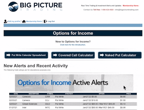
Exhibit 1A: In the previous version of the site, data for an entire calendar year was displayed on one page simultaneously, with few visual cues to distinguish sections, invoke heuristics, or assign meaning.
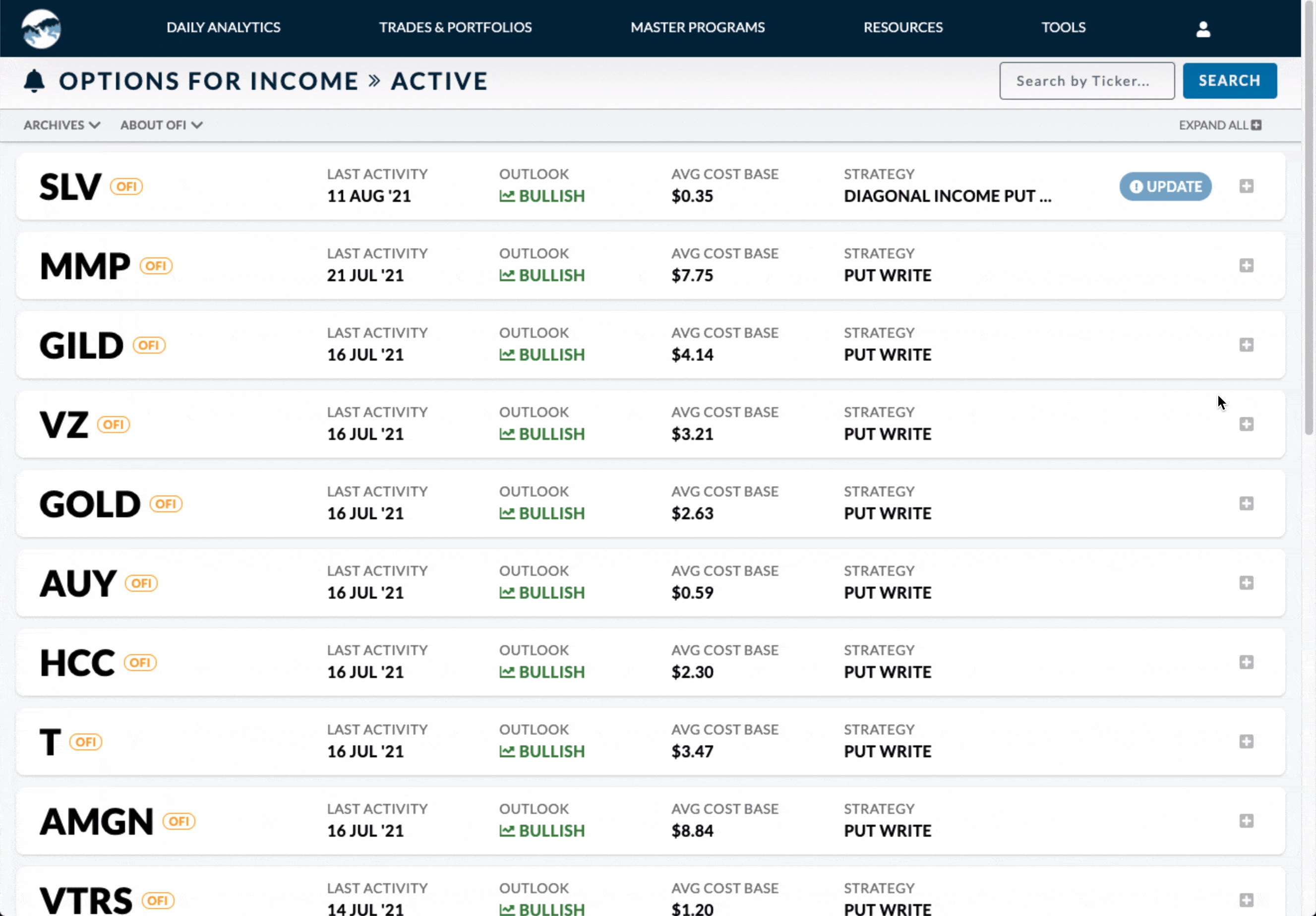
Exhibit 1B: In the corresponding reworked page, we found the right balance of what to display and hide, and introduced timestamps, search features and past-trade archives for better navigation and improved user trust.
With “improving members’ trading confidence” set as the primary qualitative objective of both BPT and this project, it was very important for us to tackle these sources of confusion head on and ship complete, easily understandable, and contextually organized UIs so that members could accurately and consistently apply presented lessons to their own portfolios, as well as find the information they were looking for.
Project Highlights
Information
ArchitectureAdventureWith 5 trade/post types that had over 30 pieces of varying meta data each, it was important to prioritize and filter what pieces of meta data appeared where, and adapt that accordingly for various screen sizes and related contexts (e.g. on a phone, a member wants a quick synopsis of new activity, but while emulating trades in a desktop environment, would prefer if info was laid out in the same order as their trading platform (Interactive Brokers in most cases)).
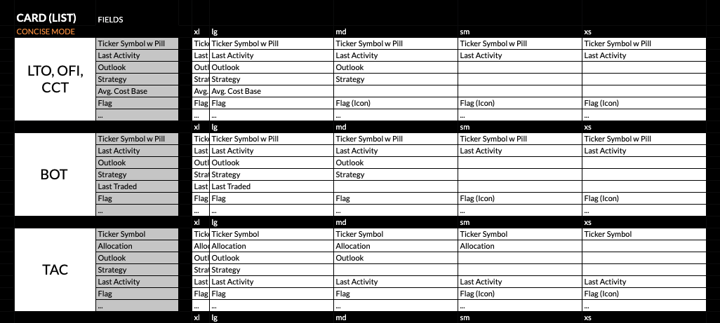
Exhibit 2: To help us organize this information and prioritize its visibility and placement on the screen, we collaborated on a series of spreadsheets. In this example, we organized top-level meta info visibility by screen breakpoint.
Developing the Design Language
Another big opportunity for improving understandability (brought up in nearly every user interview) was making sure the usage of colours, layout, and language was consistent across the trade types. Users were having difficulty viscerally identifying where updates or changes had been made, and understanding recency, priority, and action cues related to the trade examples they were interested in.
From colours, icons, to language and terminology, we worked together as a team to weed through the existing patchwork of representations, prioritize the data types, consolidate and set limits on options where necessary, and intentionally limit the flexibility of certain UI elements to keep things simple (and in many cases, force compliance with the data model). After a lot of philosophizing and ongoing user validation, we successfully established new and consistent visual patterns to convey a variety of statuses, actions, and updates, riffing on existing patterns with principles of colour theory and gestalt psychology.
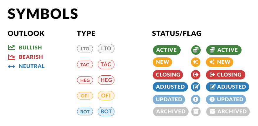
Exhibit 3: Early versions of design language symbols. These would eventually evolve into a system of dynamic twig components linked to custom taxonomies that were editable in the Wordpress backend.
One complicating factor that kept returning to bite us was the ever-so-slight variance in the ways that different types of trades needed to be presented. Where possible, we replicated patterns - but in some cases, we needed to break from the mold. This actually had pretty big implications for the underlying data model structure (e.g. post type vs. taxonomy-driven architecture) but with ongoing input testing were able to make several adjustments to the model without significant impact to delivery. I was very grateful to myself for having spent the time to build out proper and dynamic set of reusable components, custom field groups, and consistent db naming conventions, so that new templates were a breeze to build. 👏 *self-high-five*
Input on Input
Another thing we wanted to ensure was that the process of inputting and updating trades was greatly improved by the move to Wordpress: with extensive sets of data to input and minute details changing daily, it was important that the input workflow (client’s “backend UX”) was easy to navigate and operate. This was perhaps the aspect of the project with the most iterations, working together in an ongoing live-beta with the analysts (the UI's primary users) to refine the layout in such a way that intuitively integrated content alongside UI controls and other conditionals.
One of the most debated areas of the IA process was the handling of edge cases and variances in the data model and representative UI. A core user insight that ultimately drove many of those decisions was the members’ desire for consistency and clarity across the site: so in most scenarios, we leaned toward a “strict” architecture, with some affordances for adding new terms to existing taxonomies, but restricting the ability to add new data types or modify layouts.
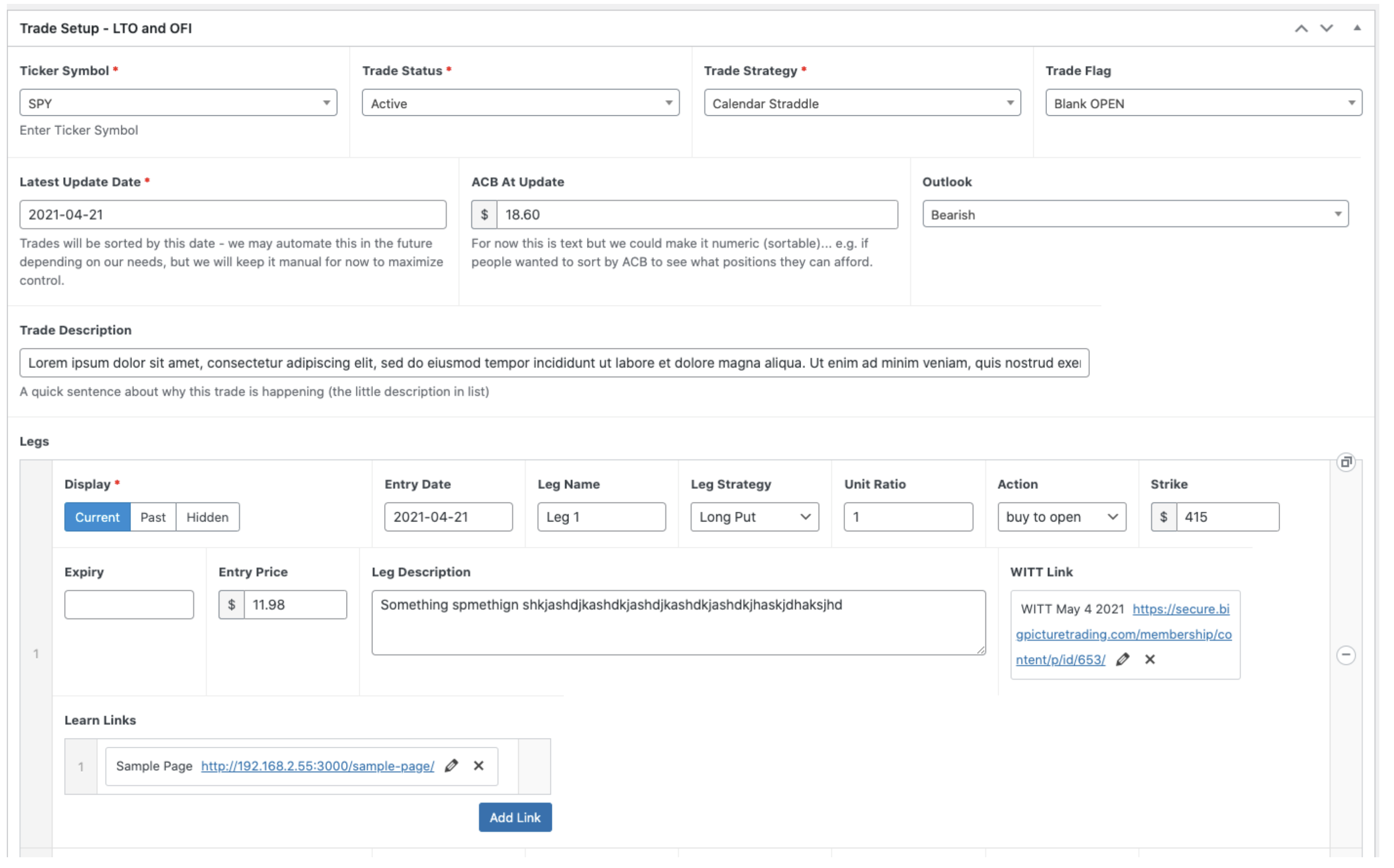
Exhibit 4A: An early version of one of the trade input UIs that could get quite long and complicated for a complex position
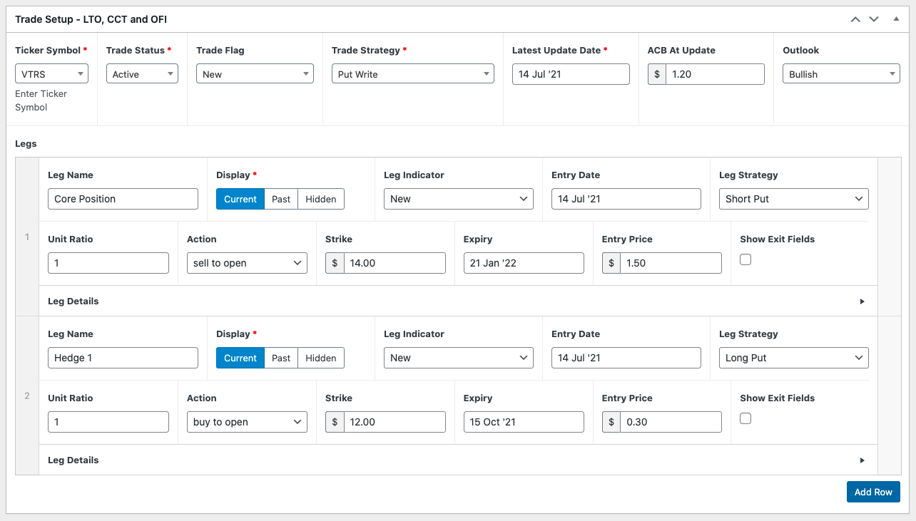
Exhibit 4B: The finalized version of the trade input UI design, with collapsible areas and toggle-able fields, allowing for a much more concise and scannable experience.
Lesson learned: *do* the validation
Having spent most of our budgeted research and testing hours refining trade detail design, we deployed our first layout version to production with a few assumptions about the broader page layout and flow, and well… we were wrong about a few things. Thankfully, we had set up a feedback form that quickly revealed two blips: a) that many of our members were still wanting to print lists of all trades out in full, expanded detail, and b) our options for filtering by any of the 6 taxonomy categories proved more confusing than helpful: people just wanted to see what was new, and where to find closed trades. Fortunately, with a robust template library built with TailwindCSS and the ease of using Alpine.js, we were able to quickly rebuild and add new interactivity features (e.g. an “Expand All Trades” toggle,) and simplify where needed.
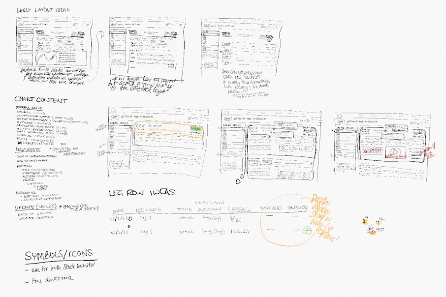
Exhibit 5A: Some early sketches for possible layouts created in Concepts for iPad (my new fave sketching app!)
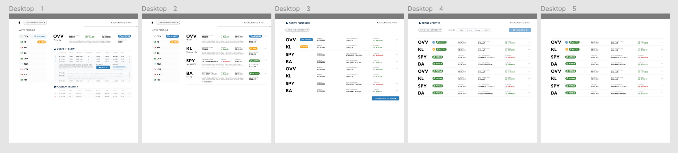
Exhibit 5B: Higher-fi versions of the above, incorporating elements of the design language for more realistic renderings.
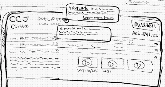
Exhibit 5C: The sample sketch of the end-user's trade detail UI.
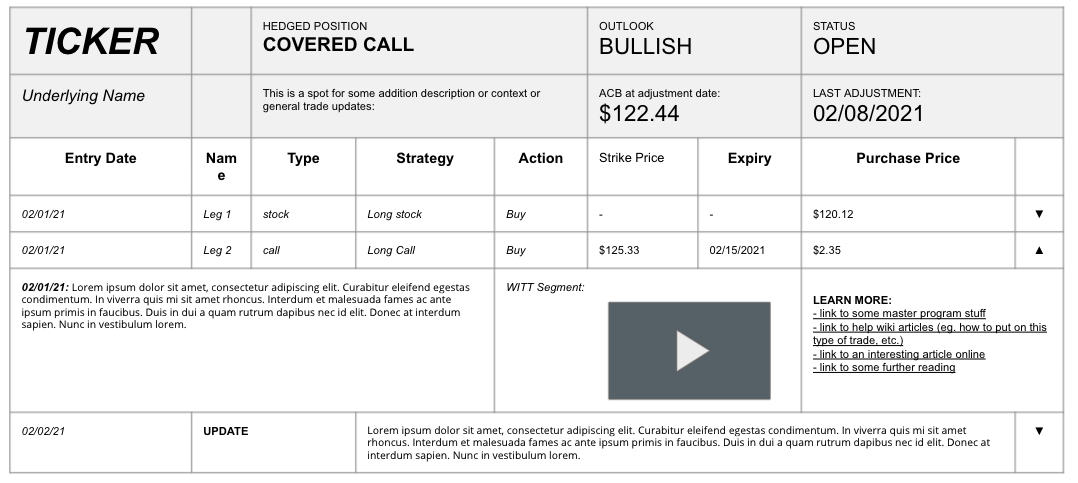
Exhibit 5D: A more formalized version of 5C we used to verify information requirements.
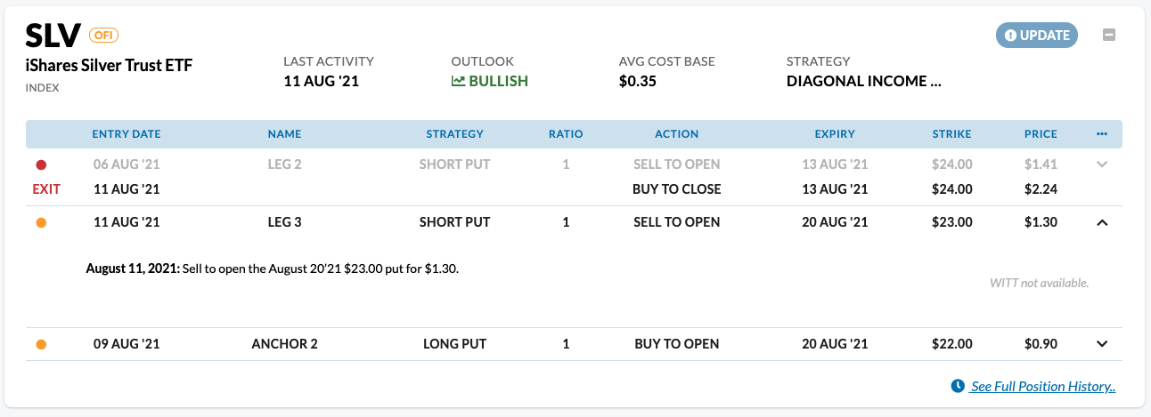
Exhibit 5E: Screenshot of the live version of the end-user's trade detail UI design.
Reflection
Though the final data model was relatively simple, parsing, categorizing, and scaffolding the vast amounts of data and variables in a clear and scalable way put my conceptual and logical thinking to the test. Though we did need to refactor the data structure a few times, investing time in determining correct hierarchies, taxonomies, and relationships between different pieces of data early on in the process had a tremendous impact on the intuitiveness of both end-user and client-input UIs. Patiently, with plenty of iteration and micro-deployments, we were able to ship a new trade updates experience that dramatically upgraded the overall experience of the product, improved product quality and value perceptions, and was purpose-built to make the process of managing all of this info easy and intuitive.
Of all of the work I did for BPT over the past year, I enjoyed this project the most. It was tremendously positive for member experience, improved in-house workflow, and gave the sales crew a high-quality, polished, and contemporary product to offer new prospects. Happy users and improved business outcomes? I'd call that a win! 🎉
Other projects I completed for BPT included the redevelopment of their course-content format, a redesign of the members’ home page, a re-skinning of account management pages managed by a legacy hosting service, an unreleased version of the public marketing site (in line with the visual style of the trade pages) which included an intensive evaluation of marketing strategy, tactics, and copy, and several other ad hoc design-oriented projects.
For further tech talk or samples of the above, or details on how I helped streamline workflows, contribute to product strategy, and integrate a wild legacy membership system, reach out for a chat!
..go to previous case (PagerDuty)!