
PagerDuty
Designing the 3rd Interface
Recreating Apps Within Slack and Microsoft Teams
PagerDuty is a digital operations management platform that notifies and deploys the right teams (IT Teams, primarily) at the right time to solve and prevent IT incidents. Recognizing the benefit of notifying responders as-directly-as-possible, PagerDuty invested in updating and improving its integrations for Slack and Microsoft Teams, the two preeminent workplace communications chat-driven collaboration platforms.
Working with enterprise clients and being able to focus on design research and execution alone allowed me to truly deepen and expand my skillset in a variety of design tools and methodologies, as well as recognize my affinity for the Product Design field. My technical skillset enabled big efficiencies in the prototying and design process of this highly technical, API-driven product area, as well as contribute to the development (and React library) of PagerDuty's design system in the process.
Project Highlights
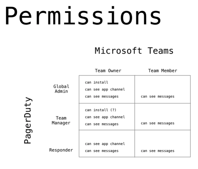
A User Permissions Matrix as Complex as The Matrix
While understanding the complexities, combinations, and setups of IT Teams and Admins was a cornerstone of the PagerDuty product itself, intersecting the PagerDuty user model with the multitude of ways Chat App products are configured and used across organizations large and small proved to be the most mind boggling part of this project. Getting this right was critical in developing our permissions models, information architecture, and determining where various configuration UIs and features should live and who could manage them.
Multiple rounds of research, revisions, and testing finally led to an as smooth-as-possible configuration flow between the apps, that also incorporated concerns around future-proofing, multi-chat-app scenarios, and security.
Exhibit 1: Lo-to-HiFi mockups for Configuration Flow
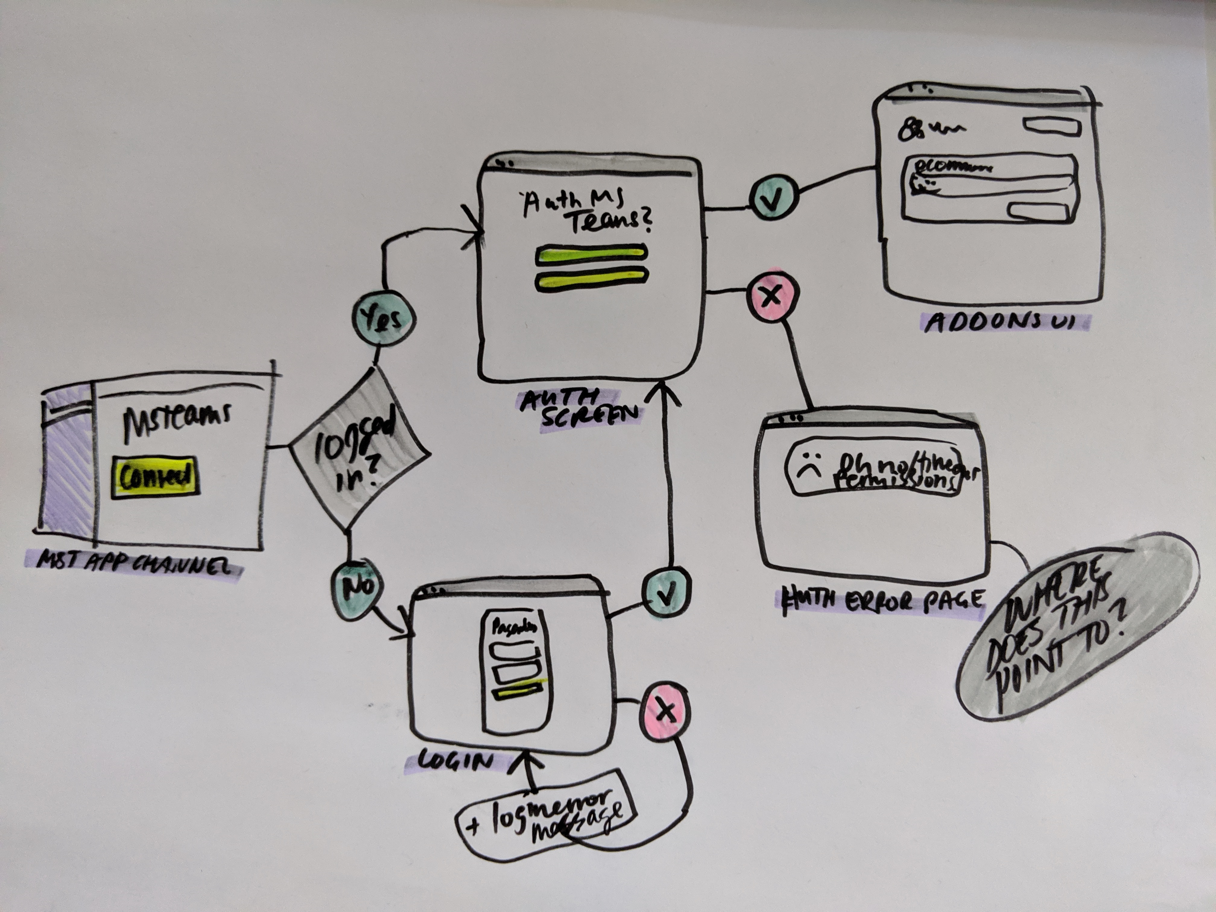
1A: An early-stage sketch of what became the user flow for PagerDuty account --> Microsoft Teams workspace configuration (a.k.a. user mapping )
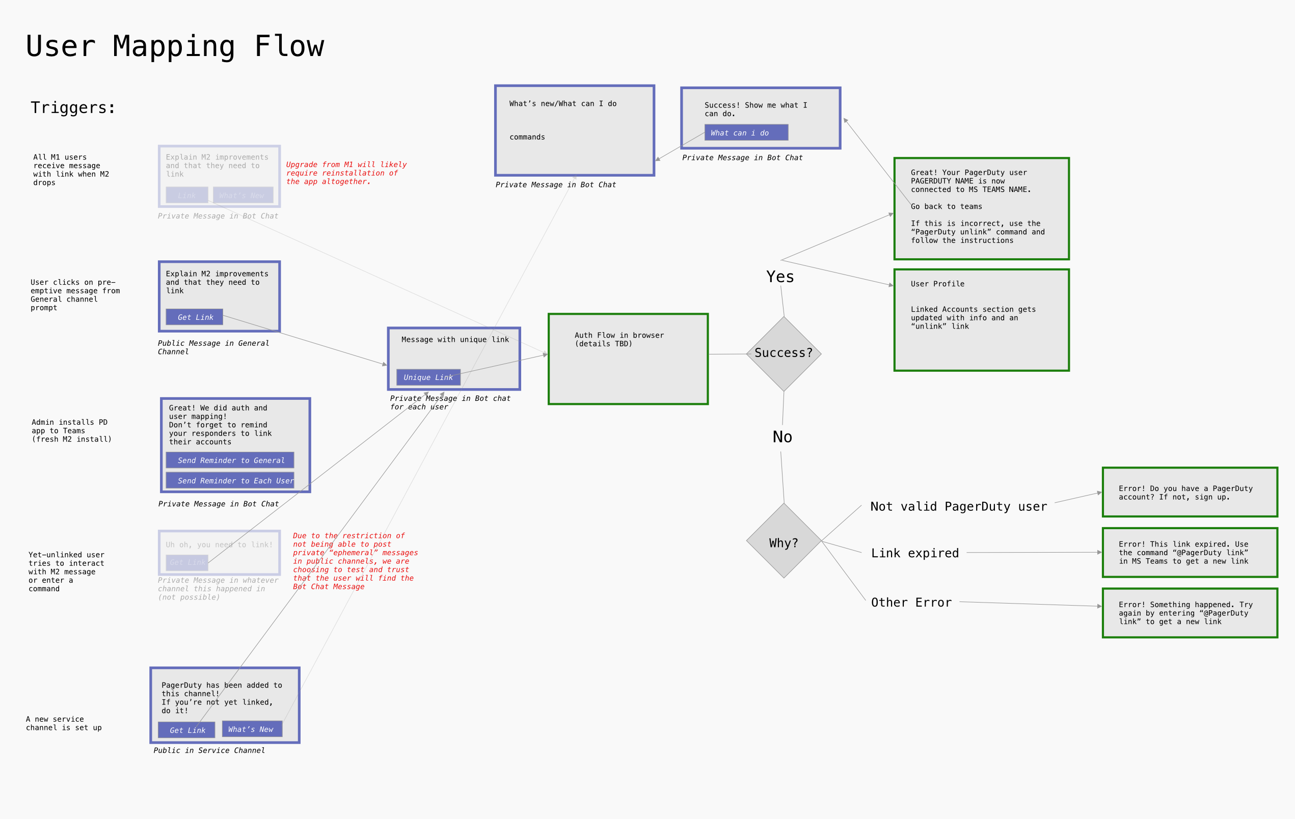
1B: The above, but expanded to incorporate messaging (as per developer request), and digitized for sharing with our internationally distributed team. We used Abstract to leave comments & discuss mockups, allowing for asynchronous collaboration between SF, Toronto, Atlanta, and Ukraine.
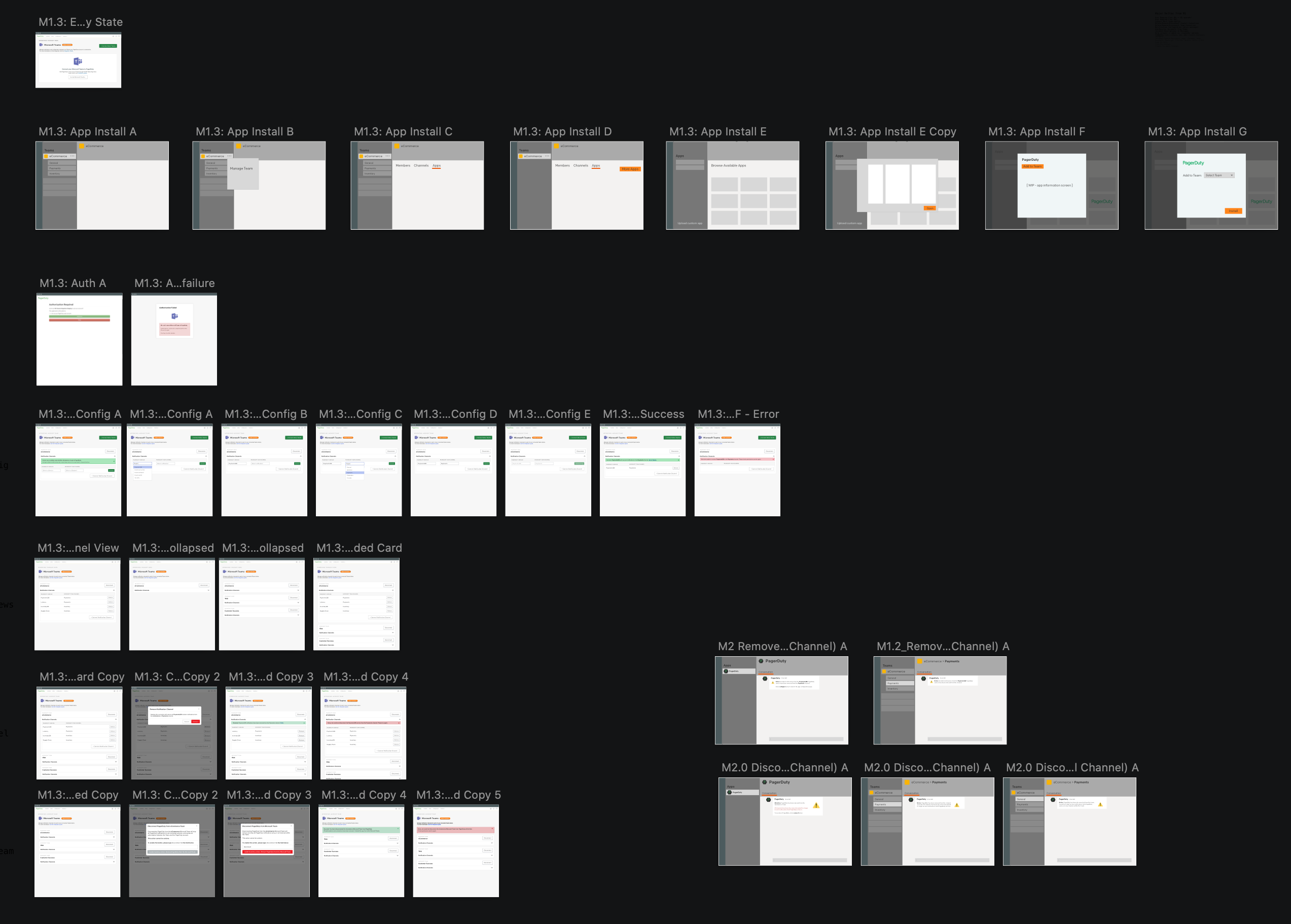
1C: A screenshot of the full-set of screens used in the configuration flow. This was a "hybrid fidelity" mockup crafted for efficiency: we did not need to spend time on hi-fi mockups where we were not in control of UI (e.g. in Microsoft Teams), but did want to capture all screens (and variables such as blank/error states and messaging) so that everything was extremely clear for our devs and common edge-cases accounted for.
I-con See Clearly Now
The urgent and time-sensitive nature of incident response requires critical information and next steps be readily available and accessible to responders with as minimal friction as possible.
One of the most prominent complaints from responders using the Slack integration was how easy it was for important, actionable messages to get lost in channel noise. We iterated tirelessly with everything from paper mockups to full implementations with our internal responders to deliver the most useful combination of information, colours, and visual cues, and made an already stressful experience slightly less so.
Further complicating this was the fact we were designing in a foreign design ecosystem, within the limited real estate of a Chat App message, using a limited set of UI elements and affordances that varied between the platforms. We had to reduce everything into simple, linear, and most-likely-to-follow task flows, which inspired us to pursue some unprecedentedly useful analytics using Segment and UTM codes that in turn informed the core product roadmap and a variety of design system improvements.
Exhibit 2: How might we be more of a lighthouse in the storm?
While bringing PagerDuty notifications into Slack & MS Teams was a big win for incident visibility & response times, previously built versions of the notifications being sent into both Slack and MS Teams were often missing key information, too frequent & verbose, “too colourful/distracting” and unclear about which messages required action, and further, inconsistent about which messages contained action buttons & items.
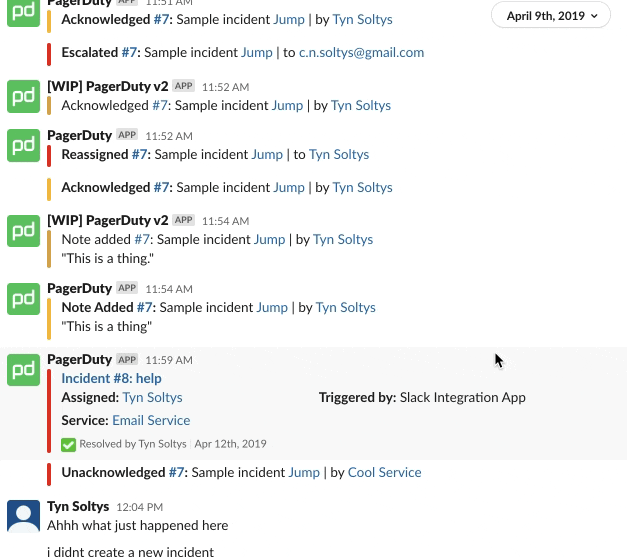
2A: In this live prototype, you can see what our responders lovingly referred to as "scrolling hell" - there's way too much going on, and no obvious place to slow down and get things done.
2B: Though still kind of busy, the big, bold icon acts as a visual anchor to viscerally communicate incident status and indicate from where relevant responder actions could be taken.
This was but one of dozens of experiments we ran to improve this experience - happy to share more in conversation.
Exhibit 3: Maybe let's not use the ⚠️ icon for the 9th time...
In an attempt to choose the best and most on-brand icons for our messages, I conducted a full product icon inventory and recognized an opportunity for us to bring a little bit more consistency and clarity to our product and platform.
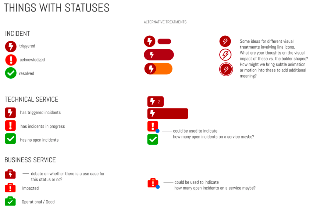
3A: Here is one of my initial proposals for a re-vamped icon system, which contains 2 tiers of information (icons for status and shape for tier of impacted service), with colour only playing a supportive role in the conveyance of important info, ensuring that colourblind users could still viscerally perceive information without needing to rely solely on colour or lengthy text... "acknowledged" is a long word.
UX for Us, too
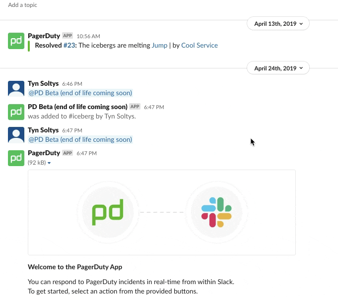
Exhibit 4: Smells like Team Spirit
I live for the high-five high of feeling in sync and in the zone as a team - with our team being distributed across 4 cities and 3 timezones, we faced our share of challenges, but learned to overcome many of them with rock-solid documentation, overcommunication, lots of empathy, and a variety of practical interventions to helps us all get on the same page.
4A: A sample reference chart created to help clarify information architecture as it pertained to permissions and user types for MSTxPD.
Having worked in the trenches as a developer myself, I am intimately aware of the decision fatigue and holdups that can strike when design mockups are unclear or missing key pieces of info. Viewing the dev team as users of the design products I was delivering, I made sure to provide the devs with everything they needed to be successful: annotations at the baseline, and where time and resources permitted, fully built out React front-ends that simply needed to be wired up to the appropriate APIs.
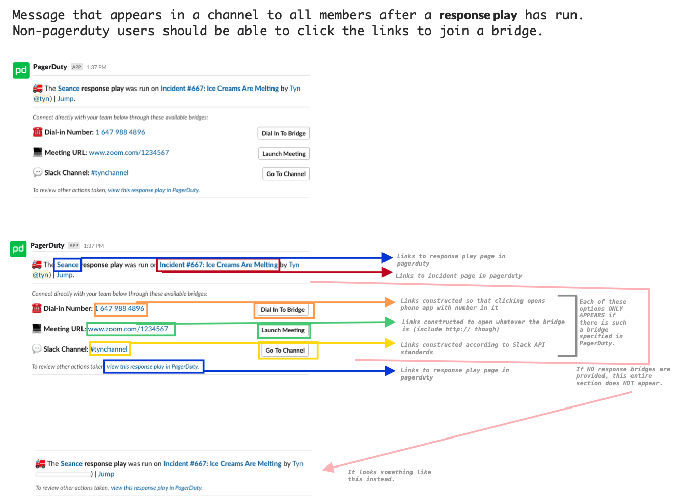
4B: An example of an annotated mockup for the Response Play feature.
Contextualizing UIs with interactive mockups, and in this case, other-chat-app equivalents helped the dev team better understand what hooks, states, and situations needed to be accounted for - not just on the front end, but in the app backend as well - and how they could implement D.R.Y. and keep things as consistent as possible between the two apps.
4C: A hi-fi prototype of our "ideal" SlackV2 incident message, with full suite of desired features included. Due to a variety of constraints, we cut back to the version on the right.
4D: A comparison of a SlackV2 mockup with our MST Early Access mockup.
Reflection
My time in UX at PagerDuty gave me great assurance that pursuing product design was the right tack to follow with my career - and though I’m still faster at prototyping with CSS Flexbox than I am configuring my auto layouts in Figma, understanding and being part of the “why” behind product design decisions brings a whole new level of meaning to my work. I definitely see myself continuing on in this field, perhaps specializing in exactly the space between design and engineering.
I believe that the next revolution in the digital product space will be the full adoption and investment in design systems and design--dev workflow engineering. Whether it be through assets like the above, component libraries, style guides, or other forms of communication, I believe that strong upstream coordination translates to downstream consistency, reliability, and scalability, and acts as a new plane of cross-departmental collaboration, as well as providing an additional forum for amplification of important matters like accessibility.
For further details and work samples from my time at PagerDuty, as well as a conversation on the adaptable and evolving UX process I've refined and developed through projects like these, reach out for a chat!
..go to next case (Big Picture Trading)!